
Once a month here in Atlanta, we invite a few folks from the data community together to discuss the "data value chain" and sharpen each other's thinking in the area of using data better. In a recent gathering we were discussing the merits and challenges of network diagrams. The stake I firmly planted in the middle of the table was this: for the vast majority of problems that folks have to deal with, network diagrams don’t help. Ever.
Ok, so maybe that was a little harsh. And as we discussed it, I had to soften my position. We concluded that there are most definitely situations where network diagrams can be successfully used. Here’s what we uncovered.
When most people think about network diagrams, this is what first pops into their heads:
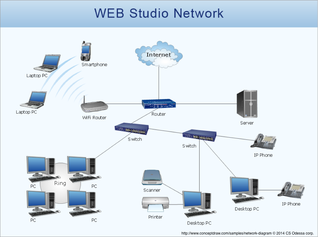
It’s great for showing the hierarchy that would otherwise only be represented in some sort of over-bloated frankenstein of a table. And I think it works pretty well for a situation with a finite number of nodes that represent physical elements that can readily be counted such as “number of routers.” This is our first lesson:
Lesson Learned #1: If you can reasonably count the nodes, a network diagram can reasonably add clarity about relationships.
So, the concept of a network diagram feels like it makes tiered data more accessible. But let’s look at more complex relationships. Take your LinkedIn network. There are lots of layers of relationships that it seems a network diagram would seem to make sense of. In case you missed it, a couple of years ago, LinkedIn Labs made network maps available to LinkedIn members in their InMaps. Here’s mine:
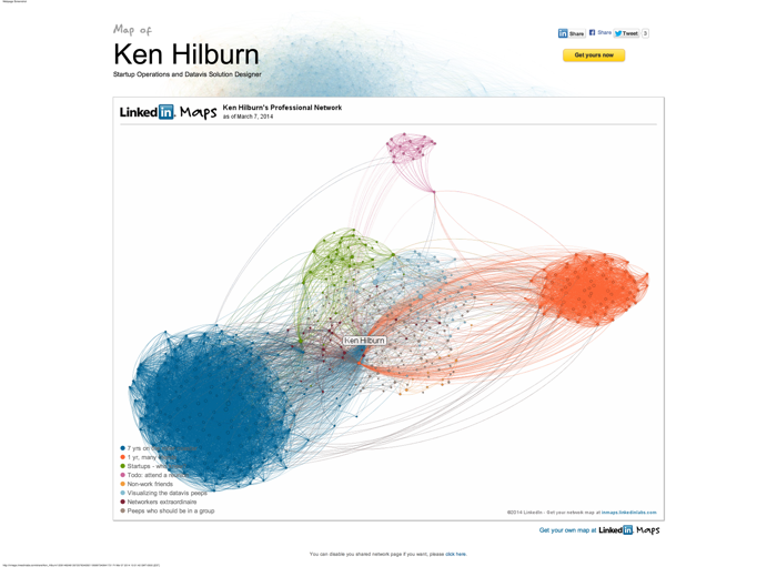
It is beautiful. They’re using a Gephi-inspired in-house development to lay out the nodes, chose the colors and stuff (if you’re interested in more on this topic, check out the Quora post - oh yeah, that guy Sal Uryasev who worked on creating inMaps is a former Juicer. Nicely done, Sal!).
I love, love, love the groupings. In my opinion, this is the most useful part of the layout. At this number of nodes, it’s not the individuals that are meaningful, but rather how those nodes group together. The approach Sal et al. used nicely summarizes a good portion of my career in about 5 large chunks such as “7 years on the roller coaster” at a dot com, and “Todo: attend a reunion” for connections I made while at Georgia Tech (the labels are mine - wouldn’t that be cool if InMaps could do that?).
But, as far as network diagramming goes, you’ll see that they’re just plotting the first-generation relationships (of which I have 500-ish) and it’s still fairly dense. Imagine what would happen if second-generation+ relationships were added (there are supposedly 11 million “in my network”). Yuck. So here is our next lesson:
Lesson Learned #2: Network diagrams with many nodes are most useful when showing aggregated groupings and relationships.
And the corollary this quickly brings us to:
Lesson Learned #2.5: When many nodes are aggregated into a few relationships, network diagrams can be used as a presentation medium. Otherwise, stick to exploration.
Ok, we have time for one more lesson. Here’s another example offered by a small company you might have heard of:

If you think about it, this is nearly the perfect problem for a network diagram to solve: making it easy for a person to find images similar to the one they’re looking at. But, this offering, inspite of it’s well crafted-ness, went nowhere.
Why? Well, one reason might be because those of us who are visual pundits would love to see these complex relationships simplified by just the right visual representation. But the fact remains that for the vast majority of people out there, advanced visualizations are just not enticing enough -- and too complex feeling -- to incite broad use. There, I said it. So, finally:
Lesson Learned #3: Even for relationships that “normal people” can easily understand, network diagrams aren’t easily traversable by “normal people.”
So, there you have it. Three-and-a-half lessons we’ve learned with network diagrams. Apply them to your next network display challenge and see how they work for you. If you need some technology to help you, check out the wikipedia article on network diagramming tools. Let us know if you find any that reveal other lessons to you.