Solve a Problem

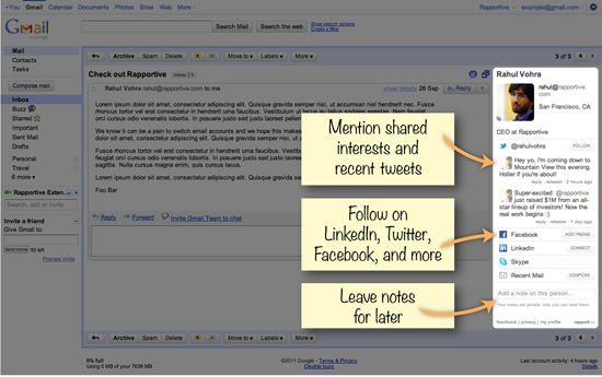
When people think about design, often they think of the visual component. For example, what colors are used and is it pretty? But when it comes to big data and building data products, there’s another piece of design that’s even more important than visual features and colors - and that’s the design of the user experience. It’s all about designing for solving a problem and that experience should be seamless for the user. To truly solve a problem, a design should first start with a real world problem or pain point it is trying to solve for and what a solution to that problem would look like. What does someone need to achieve while using your design? What should they be able to do after using it? Once that’s established, a path to get there can be designed.

The best way to figure out the problem is simply by asking. Whether solving a business or social problem, have a conversation with potential users and get to the root of the problem. Let’s take a look at some examples of problems and how they were solved.


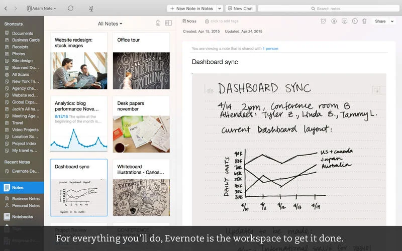
1. Evernote - This is one helpful app. Prior to using Evernote, I literally had lists, notes, etc in multiple files all over my computer screen. They piled on top of each other making it difficult to find the document you need. Evernote makes it easy to keep countless notes organized, share them, set up reminders. They took note-taking to a new level. There’s even a phone app that syncs up with everything for when you’re on the go. They solved problems I didn’t even know I had. Well done, Evernote. 


2. Pinterest - Now that pinterest exists, it’s hard to imagine a world without it. Anyone who planned a wedding pre-pinterest thinks those planning a wedding now are total wimps. Pinterest makes it easy to not only find great ideas, but to save them to come back to later. Gone are the days of emailing yourself hundreds of links to ideas that you later have click through over and over to find the one photo you need to show your florist. Now you can not only save all the links with the click of a button, but they are also saved by topic and with a photo. Problem solved. 


3. Hootsuite - Speaking of pinterest, the increasing number of social media that have popped up in recent years makes it quite hard for businesses to keep up. Keeping tabs on all of them at once can be a headache. Not to mention when you actually had to be at your phone or computer to post something. Hootsuite allows you to monitor activity on various social media from one portal, as well as schedule it out so you aren’t chained to a desk. Brilliant. 

Gradual Reveal

Description

When designing, it’s important to remember that not everyone has the same level of expertise. Nor do people always know exactly what they are looking for. Often, when too much information is put in front of someone at once, it can be overwhelming. To prevent information overload it’s important to guide people through information, while still allowing them to explore, through a technique called gradual reveal.

Gradual reveal works by designing the order of the information so that one grouping of information can be shown, or focused on, at a time. To do that effectively, start by deciding what information is most important and what order it needs to be presented in to make sense. Place the most important information at the top, or in the place where someone would begin, and layer the information from there. 

A gradual reveal can mean two different things. In one instance, only the initial piece of information would be visible. As items are selected, more visuals are added to the page. In another instance, all visuals would be visible at all times, but the reveal comes as items are selected and filters and smaller groupings are revealed. 

A few things to consider:

1. Reveals generally are left to right, top to bottom

2. Most important information should go at the top

3. Reveal information as user expresses interest

4. Consider using filtering and interactions

5. Consider timed transitions

6. Think about how different selections will take users down different paths

7. Build understanding as user moves through design


Examples

America Shakes Off Oil Addiction, Bloomberg

This graphic from Bloomberg does a great job of gradually revealing information by moving the view from page to page and revealing the story of the information as you go. 


How Many Households Are Like Us? from The New York Times

This interactive from The New York Times reveals information as interest is expressed in different types of households. Could you imagine showing everything at one? Talk about information overload!


US Gun Deaths 

his animated graphic showing U.S. Gun Deaths is a little more complex example of gradual reveal. The animation starts off slow, showing one line at a time to allow the viewer to understand what it's showing. It then speeds up to gradually reveal all the deaths and add up all the stolen years.

Use simplest appropriate visualization

“Perfection is achieved, not when there is nothing more to add, but when there is nothing left to take away.”

- Antoine de Saint-Exupery, Airmans Odyssey

Description

When choosing which visualization to use, it’s important to consider what information you really want to communicate. What is the question you are trying to answer? If you don’t know what the end user really needs to take away from reading the visualization, you could fall into the trap of showing them everything at once to cover all your bases. More is better, right? The problem is they might not know what to focus on and where to find the answer they need.

If you know what question you want to answer, you’re able to decide what context needs to be given in the visualization in order to answer that question. You can start to narrow down what data needs to be shown and decide on metrics and dimensions that should be included. The more you are able to peel away layers of information, the more useful your visual will be.

If you have a lot of information to communicate, you may choose to use multiple visuals to convey it, rather than putting everything into one visual. Once you know the metrics and dimensions you want to show, you can decide which visualization allows you to do that in the simplest way.

Of course there are exceptions to that. If your intention is not to lead a user down a particular path to answer a particular question, and you want them to be able to explore, you might have more layers of information shown. Even then, you still want some constraints. If you know where the user needs to end up, you can help them take the simplest path to get there.


Examples

Fitbit

The chart below is one of the charts shown to a user in their dashboard. It displays the number of steps taken in a day, broken down by the hour. It's a quick, clear way to see what times of day you are more active and just how active. You can quickly use the drop down buttons to change what you are looking at, if needed. Simple and effective.

New York Times, Death of Osama Bin Laden

This interactive graphic allows for more exploration. It shows thousands of readers reactions and allows you to choose which ones to read. At a higher level, it breaks responses up into four quadrants to allow users to see a quick overview of how significant and positive reactions were. While not as simple as a bar chart, it's effective at conveying overall opinion while also allowing for simple exploration.

Integration with Workflow

Description

When putting together a design, it’s important to consider your audience and how they’ll be using what you create. People are always trying to work more quickly and efficiently. Anything that can help with that is a plus. It’s important to make sure that using your design accomplishes a specific task and fits easily into their workflow to deliver what they need, when they need it. 

Here are some things to consider:

- What specific components of the workflow need to be promoted or suppressed in your design?

- Does the user complete their workflow "solo" or do they need the support of their teammates? How do you enable those conversations?

- What elements in your design can you remove to more closely match and expedite your users' workflow?

- What features do you have in your design that distract the user from completing their workflow?

- What tangible tasks does the user accomplish in their workflow? How does your design expedite completion of those tasks?

Keep in mind that the most used applications are ones that fit a specific need, are quick and easy to use and allow people to seamlessly accomplish something and move on. 


Examples

Fantastical:

This calendar easily integrates into a workflow. It displays a little calendar icon in the top bar of your Mac so that you can quickly click to have it open on top of whatever you are already doing. Quickly add tasks or meetings to your schedule, then get back to whatever you were doing before. 

Rapportive:

Rapportive integrates into your Gmail, allowing you to quickly see the LinkedIn profiles of your contacts right in your email. No need to go back and forth between your email and LinkedIn to make sure you have any details correct - it'll show up right in your email. 

               image from Rapportive.com

               image from Rapportive.com

Related Principles
Use learned structures
Use common language
Allow customization

Focus with filters

Description

When setting up filters in your design, begin with thinking about what filters you need to have and begin to group them. Consider the best way to narrow the data down to the information you care about. Choose logical groups and think about whether or not you’ll be using TAGS. The filters you decide on should help someone answers the questions who, what, when, where and how much. Generally filters are broken into 3 types of groups:

Metrics – numerical filters
Groups – text based groups, such as type of employee, lists of items, etc.
Time – time based filters, such as months, quarters

When laying them out in your design, they should be direct and easily accessible. Avoid lots of configuration screens – they tend to be chunky and not as easy to access.

Examples

Good usage: www.JWT.com – simple, obvious and categorial filtering supported by sort and searching controls.

home-JWT.com_1.jpg

Good usage: Crossfilter – rapid feedback on filtering.

Crossfilter1.jpg

Good usage: Elastic lists – advanced filtering shows cascading filters.

5-years-of-infosthetics1.jpg

Resources
Best practices for designing faceted search filters
Live Filter Design Pattern
Faceted search: 4 design tips

Related Principles
Encourage exploration
Keep it lightweight
Control detail density
Allow direct manipulation

Provide next steps

Description
When providing the next steps for a user in an application, it is important to keep the end goal in mind. The challenge is that goal can be very different for each person. To avoid overwhelming the user with too many options, predict logical next steps at meaningful points in time.

There are multiple ways to organize how a user attains information and which method to use is based on how linear or fluid the path to the end goal is. For a linear, sequential path, there would always be a specific next step that must be taken. To lead the user to the next step, a clearly labeled button or input component would be necessary. You don’t want to make the next step difficult to find or get to.

An example of this would be something like a Travel booking site, such as Travelocity, or an online shopping site. There are clear steps laid out for the person making the purchase – find the product you want to buy, select the product, decide which options you want included (quantity, color, etc), give your shipping and billing information and whalah! You’ve followed the steps to reach your goal of buying something.

For a less linear path to completing a goal, it’s necessary to organize the information well and provide clear guidance to the next possible steps. To know what steps to guide them to, think of the goal. Are there multiple factors affecting the ability to attain that goal? If so, direct the user to those different factors. You could even rank the usefulness of the different options to guide the user to what would have the most impact up front, or to show them a logical order, though they may not want to follow it.

For example, on LinkedIn when you are setting up your profile, there is a section where it lets you know how much of your profile is complete and gives you suggestions of different ways to complete your profile and make your profile more attractive to other professionals.

linkedIN.png

In a data visualization context, if you are looking at sales goals and sales numbers, you can try to point the user to information about their productivity that will inform on ways to have their sales numbers match their goals. Maybe there is a stronger correlation between the number of sales calls made and sales results than between the number emails sent and resulting sales. Showing a ranking of the various things that can be done to reach a goal not only provides a next step for the user, but provides some context for which step to take next.

Examples
Poor usage: After opening this program, the very first thing I saw was a prompt asking me a very specific question. At this point I hardly, knew what the program was for, let alone what my camera’s frequency should be and if that mattered.

Source: ASUS Lifeframe

Source: ASUS Lifeframe

Good usage: Here is a familiar process, done perhaps better than you’re familiar with. This is a very linear process keeping the required action very large and obvious on the left with any additional detail updating as needed in deemphasized text to the right. The scrollbar shows your progress naturally.Test it out.

Source: https://en.wordpress.com/signup/

Source: https://en.wordpress.com/signup/

Related Principles
Suggest related items
Flow
Gradual reveal
Contextual help
Provide instruction
Encourage exploration
Present invitations
Provide goals
Communicate progress

Consider data comfort and expertise

Description

People using your application may have all different types of backgrounds and understandings of data and visualizations. It is important to keep this in mind when designing. If you will have a mix of novice and advanced users, it is important to think about how that will affect the application’s workflow and the data presentation. You don’t want to overwhelm and confuse the novice user, but you want to include appropriate features for the advanced user.

Choosing the right chart for the information you have and using the simplest appropriate visualizations, especially if you will have novice users, are two important things to consider. Simpler options would include things like a standard bar chart, pie chart, map or trend chart. More advanced options would be a bubble chart, treemap, heatmap, parallel coordinates or sankey chart, among others. Of course if you will have more than one level of user, there are some options to keep in mind to make the application most useful for everyone.

One thing to do is to use common language. Someone that is more familiar with the data or data field may understand the jargon associated with it, but novices can easily be confused by language that is confusing or misleading. Instead of technical or specialized terms, stick to standard and common language.

You can also make a more complicated visualization usable for a novice by clarifying with annotations, tooltips or other using other ways to provide instruction. For example, this interactive from The New York Times uses a stream graph. This would be considered a more advanced visualization, which the The New York Times is known for. But as a newspaper, they must also make their graphics accessible to the general reader. To make this chart more friendly for the general reader, they added keys and explanations as to how to read the chart on the right. Someone that doesn’t need that help can easily ignore it, but it’s there for those that need it.

Another option would be the use of drill down. Often it’s possible to have a more simple data up front, and reveal more detailed information and visualizations upon clicking and drilling down. This type of data flow would make it easier for a novice user to see how the data relates and not get too much information too soon, but it’s also easily accessible for the advance user.

Customization is also an option, though not used often. As users get more familiar with the data and interface, controls could be added that would allow for deeper exploration and more advanced visualization and control.

Examples
Beginner charting example: Chart Chooser line chart

trendChart.png

Advanced charting example: NY Times stream graph

nyt-streamgraph.png

Resources
Can Familiarity Trump Usability

Related Principles
Provide instruction
Explanation before information
Clarify with annotations
Allow customization

Make it conversational

Description

What does it mean when we say to make it conversational? It can mean a couple different things, but overall the idea is to make information more accessible and recognize opportunities to add some personality.

Some initial places to look for opportunities to add personality and a conversational tone could be in labeling, instructions and section headers. For example, instead of labeling a section “Number of visitors to your website,” consider making it more conversational with “How many people visited your website?” Breaking up information in smaller parts with labels structured the way that people would ask something in conversation can make getting to the information easier and more fun. Another place where this might be appropriate could be when greeting a user upon login. Instead of being more formal with “Hello, Jane” you could spice it up with “How ya doin, Jane?” or something along those lines, depending on the tone and personality you are trying to achieve.

Places where a more conversational tone can be used would also be in annotations and pop ups that give additional information. Instead of shortening information to fit nicely on screen, those are places where a little more text and explanation in a conversational tone could be appropriate.

Another slightly advanced approach to making things more conversation is within an actual visualization itself. There are not always opportunities for this, but if you find one, this can be a great way to lead a viewer through the data. For example, if your data is broken into a few different visualizations and charts that actually make the information feel disjointed and less cohesive (ie. several repetitious labels), consider trying to combine things into a different visualization that would allow a more clear conversational data structure.

With all these opportunities for making things more conversational, it is important to remember to keep the context of the information in mind and think through whether or not adding these things actually helps the information you are presenting and makes it more accessible or not. If that’s not the case, then maybe that isn’t the right place to insert it.

Examples

Scoutmob.com – Exhibiting one of the growing trends in writing that’s personable and fun.

Scoutmob_iPhone_Android_and_BlackBerry_apps-20120330-150418.jpg-e1333135874603.jpg

Google Docs – Arrow points out information that typically would be bullet points is now in a short meaningful sentence.

Technology_Bracketology_-_Round_4-20120330-145955.jpg-e1333136275146.jpg

Pipeline Deals – Customize the header sentence as a filtering mechanism

PipelineDeals_-_Deals-20120330-144238.jpg-e1333136378903.jpg

Juice.com | About Us – Section are expanded and collapsed based on a sentence structure to the left.
 

About-Us-–-Juice-Analytics-1-e1333136472519.jpg

Resources
Groupon Editorial Manual

Related Principles
Use common language
Avoid info overload
Match data structure visually
Clarify with annotations

Use common language

Description

This principle is all about the words you use. It is important to use common language that is easily understandable. If someone using your website, dashboard, etc has to google several of the terms used, that is a problem.

When thinking about the language you use, think about your audience. Who is it? How do they talk and write? How well do they understand the details of your industry, etc.? For example, within the medical world, it may be understood that “cephalalgia” is a medical term for headache, but if you tell the average person that you have a cephalalgia they may wonder if that’s a disease or some kind of growth. That’s probably not what you want. With many viewers, you want to use language that the person with the least understanding will be able to follow. If there is not a way to take a concept and break it down, have a definition handy and accessible, such as in an annotation.

Another thing to consider is native language and the country your audience may be from. If you will have people from various countries viewing your site, having a language control could be important. Also, words in one country can mean something different in another. For example, in the U.S. when we ask for chips at a restaurant, we mean chips, right? Like Doritos or tortilla chips. But in some places chips refer to what we in the U.S. call fries. You’ve heard of “fish n’ chips” haven’t you? So keep that in mind in the case that you have an international audience.

Examples
Poor usage: It’s almost too easy to find this principle horribly implemented in error or notification messages. In fact, it can be downright comical:

image1.jpg
to-delete-or-not-delete.jpg
Disable-and-Remove-Windows-Genuine-Advantage-Notifications-Nag-Screen-«-My-Digital-Life.jpg

Good usage: Perhaps one of the most experienced and worst examples of poor common language is html error pages like a 404 page. You’ve experienced those, so instead let’s look at some good ones.

Bergan-BLue-Error-404-Page-Not-Found2.jpg
Error-404-Not-Found1-12.jpg

Resources
The Writing Center
Customer Communication? Stop Talking Gibberish
Data Quality from the Ground Up – Use Common Language Please

Related Principles
Flow
Clarify with annotations
Support role
Allow for casual use

Promote patterns

Description

Patterns can be many things – a spike on a trend of products at a certain time, or clustering of objects in a bubble chart showing a pattern of commonality. A primary goal of patterns is to discover cause and effect.

But when displaying data with the purpose of showing patterns, you want to make sure that your users are actually seeing those patterns. In order to do so, it’s important to know how to emphasize and call attention to them.

One way to do this is by showing a view that allows one to see multiple sets of data at once. When looking at all of them together, a pattern may be seen. Examples of this include small multiples and whisker plots. Both have examples shown below.

Another way would be to highlight certain information that reveals a pattern with the use of contrast, shape, movement and/or size.

Take the wind map from below for example. Through the use of contrast and movement, wind all around the country is shown in patterns. On the other hand, you could also take multiple wind maps and place them side by side in a small multiples format and show patterns of wind over time.

Despite your approach, make sure the pattern stands out and that the use of visualization and layout complement your desire to show patterns.

Examples
Small multiples – Zach from Juice discusses the comparison tradeoffs in this chart type which simplifies pattern recognition. Here is another example of these as trends.

smallmultiples1-1.png

Wind Map – This beautiful visualization by the good folks at hint.fm shows patterns by plotting all wind data simultaneously as it happens. The culminating shape and speed of the wind itself is comparable from region to region.

Wind-Map_-Historical-1-1-1.png

Win-loss whisker plot – Here is another type of small multiple that allows one to quickly scan patterns between two options. In this case it is wins(blue) or losses(red) or ties(grey) of the 2011 MLS season.

Sparklines-for-MLS-Season.png

 
Related Principles
All on screen
Track changes
Emphasize the interesting